

07 — Visualization and reports
Everything a run produces lives in its directory (.soma/runs/<run_id>/), and
everything in this notebook is a reader of those files. Three layers:
readers and aggregation (Rust, RunView), overlays on the graph (annotated
mermaid/graphviz), and Plotly figures (soma.viz, the
pip install 'somatize[viz]' extra).
import json, pathlib
import plotly.io as pio
import soma
# Interactivo (zoom/hover/brushing) en Jupyter y VS Code, con# fallback PNG donde no hay JS (GitHub incluido).pio.renderers.default = "plotly_mimetype+png"pio.renderers["png"].scale = 2      # crisp on retina displayspio.renderers["png"].width = 950from soma import Filter, Graph, Study, search

class Scaler(Filter):    _cache_version = "nb07-scaler-v1"
    def fit(self, x, y=None):        return {"mean": sum(x) / len(x)}
    def forward(self, x, state):        return [v - state["mean"] for v in x]

class Model(Filter):    _cache_version = "nb07-model-v1"
    def fit(self, x, y=None):        return {"w": 0.5}
    def forward(self, x, state):        return [v * state["w"] for v in x]

g = Graph()g.node("scaler", Scaler())g.node("model", Model())g.connect("scaler", "model")
with g.track_run("nb07-fit", kind="fit", tags=["demo"]) as run:    g.fit([1.0, 2.0, 3.0, 4.0])    for step in range(6):        run.log("loss", 1.0 / (step + 1), step=step)        run.log("val_f1", 0.6 + 0.06 * step, step=step)
run.id'run_20260804T003418_2953'Listing and inspecting runs
Section titled “Listing and inspecting runs”soma.runs() scans <root>/runs/, newest first. A running run whose
heartbeat has expired is reported as crashed. Each RunView aggregates the
event log into shapes that are ready to plot.
runs = soma.runs() # RunList: en notebook se renderiza como tablaview = runs[0]runs| run id | kind | state | created | duration | name |
|---|---|---|---|---|---|
run_20260804T003418_2953 | fit | completed | 2026-08-04 00:34:18 | 0.0s | nb07-fit |
import pandas as pd
print("cache:", view.cache_activity())pd.DataFrame(view.node_timings())   # per-node spans, ready to tabulate
cache: {'hits': 0, 'misses': 2, 'by_node': {'model': {'hits': 0, 'misses': 1, 'last_tier': None}, 'scaler': {'hits': 0, 'misses': 1, 'last_tier': None}}}.dataframe tbody tr th { vertical-align: top;}
.dataframe thead th { text-align: right;}| node_id | started_ts | finished_ts | duration_ms | outcome | cache_tier | error | |
|---|---|---|---|---|---|---|---|
| 0 | scaler | 2026-08-04T00:34:18.980574338Z | 2026-08-04T00:34:18.981158640Z | 1 | completed | None | None |
| 1 | model | 2026-08-04T00:34:18.982111948Z | 2026-08-04T00:34:18.982638040Z | 1 | completed | None | None |
The annotated architecture
Section titled “The annotated architecture”The run’s graph with its overlay: per-node duration, cache hits and health
flags, coloured by status. view.to_svg() is a self-contained SVG —
to_mermaid() and to_graphviz() exist too, for docs and external tools.
from IPython.display import SVG
SVG(view.to_svg()) # mismo overlay disponible en to_mermaid()/to_graphviz()Figures
Section titled “Figures”Methods installed on RunView, returning interactive Plotly figures. They
need the somatize[viz] extra.
view.plot_metrics()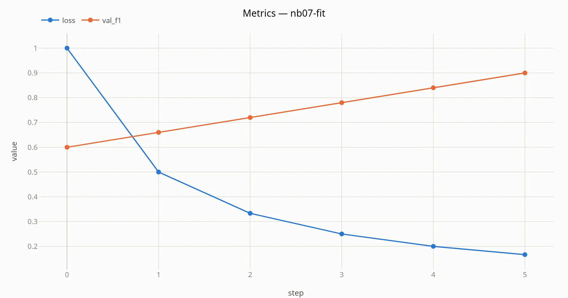
view.plot_gantt() # where the wall clock went, node by node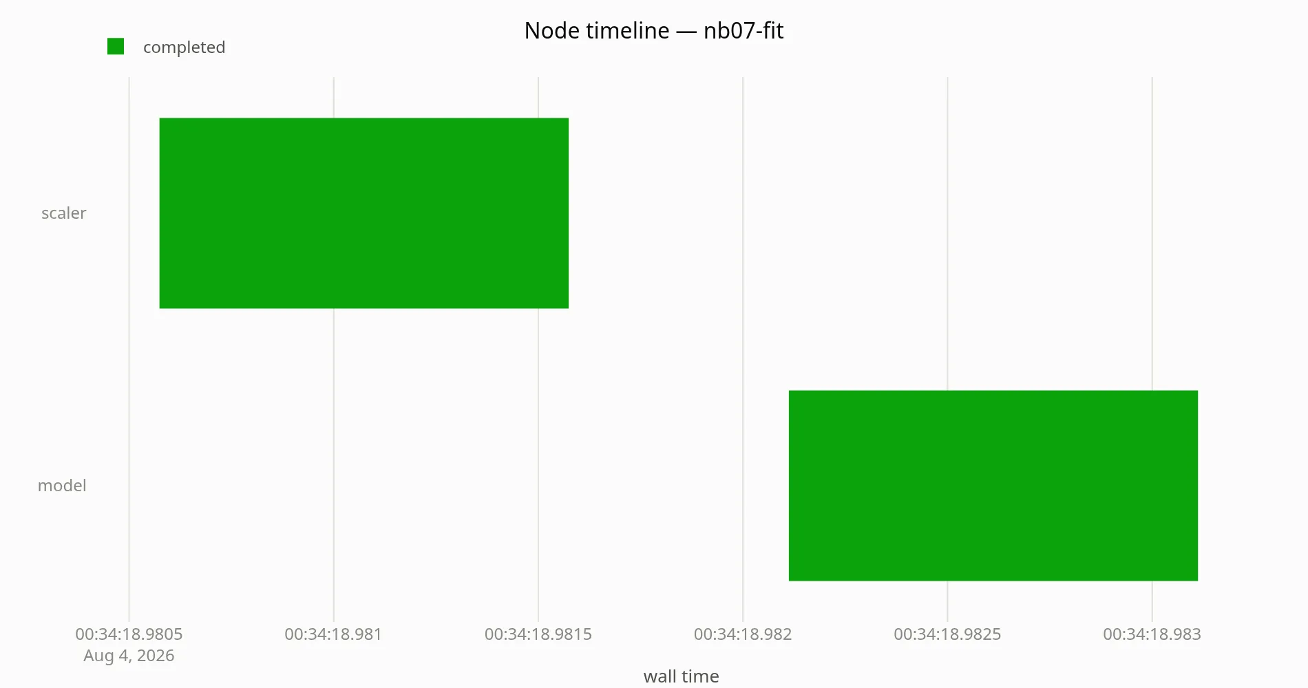
Optuna-style optimization
Section titled “Optuna-style optimization”A Study is a run too — its run directory has a study.json — and the
figures carry Optuna’s names so nobody has to learn new ones. In a terminal,
study.run(objective, progress=True) also draws a tqdm bar with the best
value as its suffix (the somatize[viz] extra).
def objective(trial):    for step in range(5):        f1 = 0.5 + 0.35 * trial["lr"] ** 0.2 * (step + 1) / 5        if trial.report("f1", f1, step):            return None    return None

study = Study(    "nb07-hpo",    search_space=[        {"type": "float", "name": "lr", "low": 1e-4, "high": 1e-1, "scale": "log"},        {"type": "float", "name": "dropout", "low": 0.0, "high": 0.5},    ],    strategy="bayesian",    n_trials=8,    objectives=[("f1", "maximize")],    pruning=("median", 2),    seed=42,)study.run(objective, progress=True)study.best_trial["id"], study.best_trial["metrics"]
nb07-hpo:   0%|          | 0/8 [00:00<?, ?trial/s]
nb07-hpo: 100%|██████████| 8/8 [00:00<00:00, 219310.01trial/s]
nb07-hpo: 100%|██████████| 8/8 [00:00<00:00, 8520.68trial/s]
('trial_0006', {'f1': 0.6971705694400159})study.plot_optimization_history()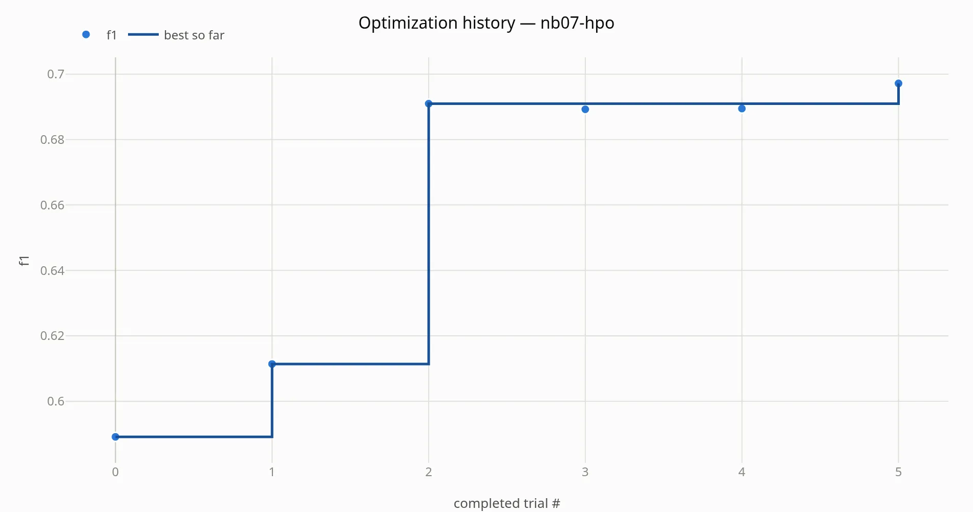
study.plot_parallel_coordinate()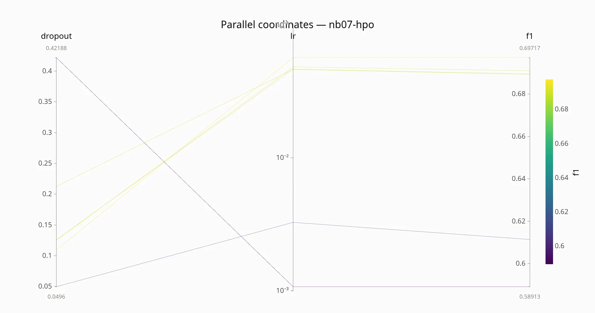
study.plot_timeline()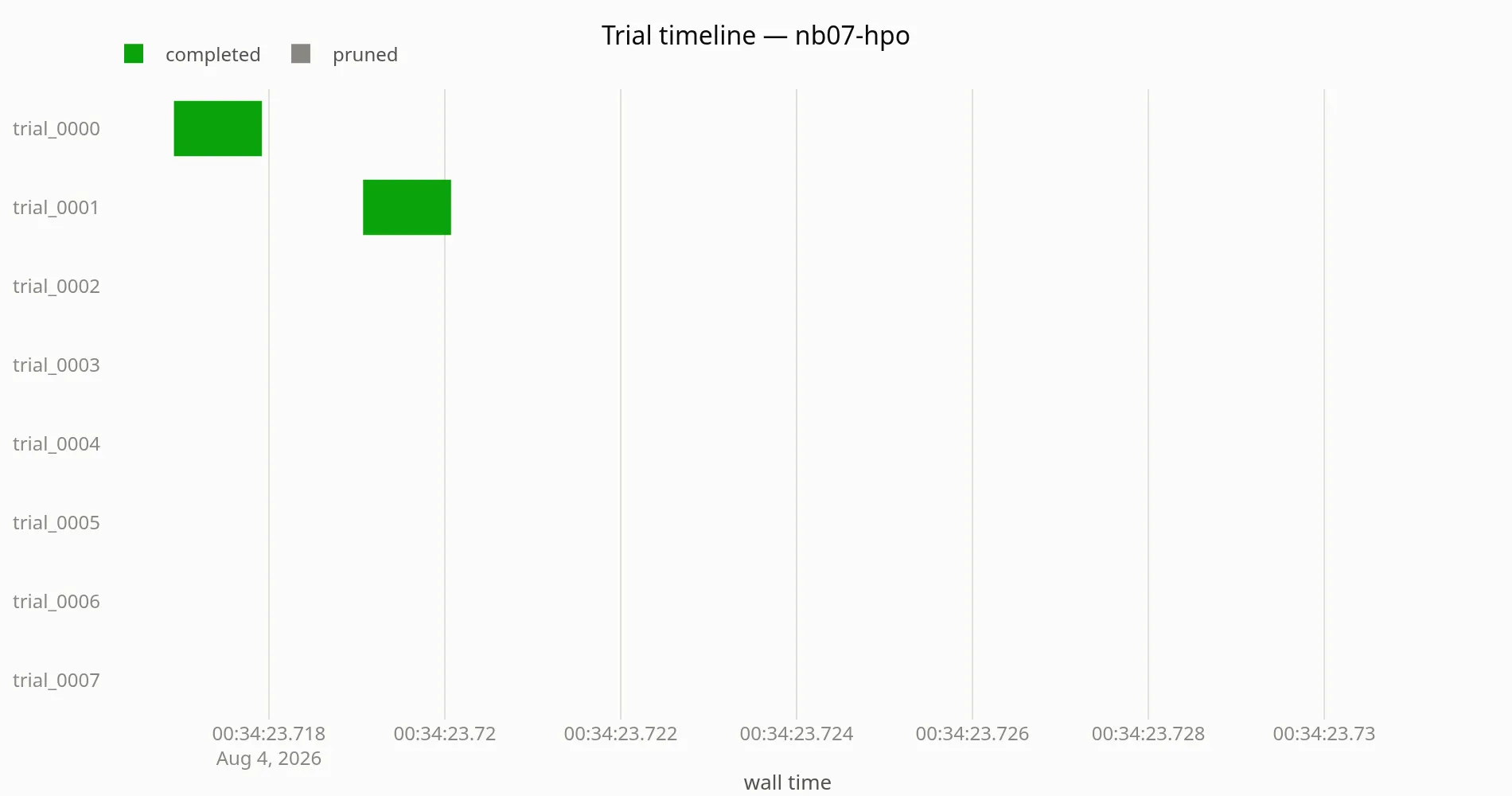
study.trials_dataframe().head().dataframe tbody tr th { vertical-align: top;}
.dataframe thead th { text-align: right;}| trial_id | state | started_at | finished_at | duration_ms | param_lr | param_dropout | metric_f1 | |
|---|---|---|---|---|---|---|---|---|
| 0 | trial_0000 | completed | 2026-08-04 00:34:23.716920285+00:00 | 2026-08-04 00:34:23.718344859+00:00 | 1 | 0.001071 | 0.421878 | 0.589134 |
| 1 | trial_0001 | completed | 2026-08-04 00:34:23.719070575+00:00 | 2026-08-04 00:34:23.720303392+00:00 | 1 | 0.003266 | 0.049605 | 0.611397 |
| 2 | trial_0002 | completed | 2026-08-04 00:34:23.721275367+00:00 | 2026-08-04 00:34:23.722117053+00:00 | 0 | 0.048341 | 0.125046 | 0.690955 |
| 3 | trial_0003 | pruned | 2026-08-04 00:34:23.723029649+00:00 | 2026-08-04 00:34:23.723545721+00:00 | 0 | 0.000259 | 0.303276 | 0.540271 |
| 4 | trial_0004 | completed | 2026-08-04 00:34:23.724511388+00:00 | 2026-08-04 00:34:23.725382387+00:00 | 0 | 0.046212 | 0.212712 | 0.689243 |
The HTML report
Section titled “The HTML report”One self-contained file per run: the annotated DAG, efficiency tiles, curves,
an HPO section with the trial table, and a health section. From the CLI:
soma report <run_id> (--inline embeds plotly.js so it works with no
network). The embedded <script id="soma-data-*"> blobs are the contract the
future GUI will read.
html = study.to_html(path="nb07_report.html")print(f"nb07_report.html: {len(html) / 1024:.0f} KiB")print("secciones:", [s.split("</h2>")[0] for s in html.split("<h2>")[1:]])nb07_report.html: 30 KiBsecciones: ['Efficiency', 'Metrics', 'Optimization', 'Trials', 'Health']